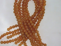
Tried with different lighting inside and different backgrounds. Just was not satisfied and this satisfaction is based soley on my own; like your pictures have to be based soley on your satisfaction. Yes you can go in the forums and ask how people like your pictures but come down to it, how do You like your photos? Some like the bright color backgrounds, some bright white to black. I've used them all and it just wasn't saying what I wanted my store to say. I'm a total California girl who loves the mountains and beaches and everything nature has to offer. Want to bring that into my stores. My background for pictures now are from the outside world and I am very excited about the outcome. Now I do still need to work on timing and when to go outside. And believe me 10 minutes makes a big difference as one day I went to get something inside and when I went back out the sky had ugly dark clouds and God opened the flood gates. All things purple or hot pink are the only colors really frustrating me at this time, just can't get the right hues to show up in the digital camera still.
Well anyhoo here are some before and after pictures so you can see how a store like me still keeps trying to find that "1 look" that fits your store. It may not be a big difference for some but I want a look that will smoothly transition throughout my stores and keep a uniform look for glass, gems, lucite, crystals and make the beads themselves "pop" out and have the background be exactly that. So the below pictures are of Red Aventurine. I really do like the 2nd picture and the look with the store name but the white background is just not working for all beads. The final picture's backdrop has been working great and even my vintage lucite just "pops".


No comments:
Post a Comment